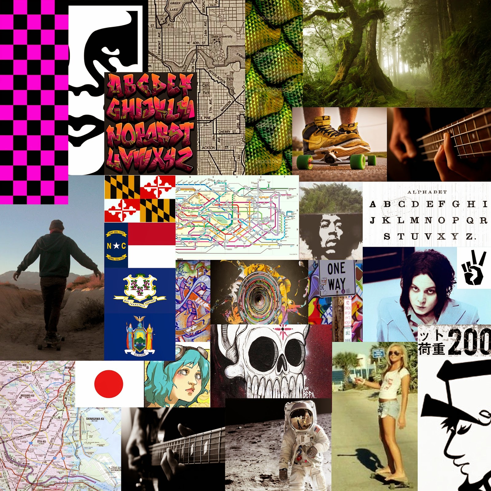
Mood Board. Salutations! A new player has entered the field. Bringing the East Coast style all around the globe with a high end skater brand.

(The) Middle Way
FI
N
D
Y
O
U
R
S
E
L
F

Logo Sketches - I really like the rat in this sketch. That and longboard. I am pretty satisfied with the name. I'm pretty sure that its the final name. Although the typography that I've drawn this far is far from done.


Jokes on you guys! I actually know 3 sets of Identical Twins! No Photoshop needed!
...but for real I enjoyed this assignment. Surprising how simple it was to do.

This project was a little frustrating for me. Had a bit of a difficult time. However I still like how it turned out. Feedback appreciated!

I really like how this project turned out, but I feel without a complete line up of finished projects it might be confusing. I tried to replicate a Buddhist mandala because the company is called The Middle Way. That is a Buddhist motif meaning balance. Along with that I reasoned that Buddhism's tranquil identity could fit nicely with the laid back attitude surrounding long boarding.
AND typeface. Let me know what you think!


For some reason the green in the first one is almost fluorescent.


If it's not too small you should totally read my products. They're state of the art yo!
Trifold Brochure-


Business Card-


