I love the concept of your brand. The skin poster is really cool and the blue really stands out and great line work on the animal skeleton and positioning, makes it seem like she's in a nature environment.
Logos: I like how well your brand is represented in your logos, it is easy to tell what type of clothing you are selling. The typography in the middle is really great! It might look cool to put the tree inside the circle in the o of the word soul
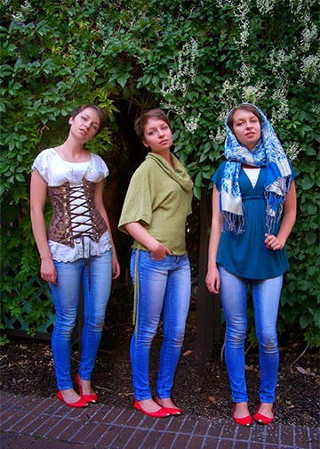
Composite Images - very earthy and a great location for the photo shoot! I particularly like the interaction of the model in the second image and the lighting in the third.
Composite: I like how you done different locations of the images and have different variety of clothing that would match your clothing brand. Way to think out side of the box.
Weaving poster: I like how you added some texture in the weaving part of the poster, also you did a very good job in creating the face and your color choices really match your mood board.
Your poster turned out really good. Your model doesn't look photoshopped at all, and the weaving was done very nicely. I also like that you did not use the splatter brush and used something that fit your brand more :).
The typeface you choose works great for your brand. I love the colors and the foliage you chose. I wish I saw a little more green since your branding is so nature filled and doesn't seem to be exclusive to one season or the other.


Creative idea of the clothing brand that is inspired my nature. Great color choices, however I think you need some typography.
ReplyDeleteYour skin poster is pretty cool, I love how the background brings the color of the blue shirt out. It grabs your attention.
ReplyDeleteI love the analogous color scheme. It feels calm and serene. The texture in her clothes works to make her the focus.
ReplyDeleteNot to mention the texture you put in! It's fantastic!
ReplyDeleteMood board - Really awesome idea! I love some of the design ideas you have on here. Only thing missing is a couple typography examples.
ReplyDeleteI love the concept of your brand. The skin poster is really cool and the blue really stands out and great line work on the animal skeleton and positioning, makes it seem like she's in a nature environment.
ReplyDeleteLogos: I like how well your brand is represented in your logos, it is easy to tell what type of clothing you are selling. The typography in the middle is really great! It might look cool to put the tree inside the circle in the o of the word soul
ReplyDeleteComposite Images - very earthy and a great location for the photo shoot! I particularly like the interaction of the model in the second image and the lighting in the third.
ReplyDeleteComposite: I like how you done different locations of the images and have different variety of clothing that would match your clothing brand. Way to think out side of the box.
ReplyDeleteWeaving Poster: I love how the colors are complementing each other and really fits in your mood board and the style of your clothing brand.
ReplyDeleteWeaving poster: I like how you added some texture in the weaving part of the poster, also you did a very good job in creating the face and your color choices really match your mood board.
ReplyDeleteYour poster turned out really good. Your model doesn't look photoshopped at all, and the weaving was done very nicely. I also like that you did not use the splatter brush and used something that fit your brand more :).
ReplyDeleteyour face mashup is super good! the model is hot!!! you did a good job!!
ReplyDeleteThe typeface you choose works great for your brand. I love the colors and the foliage you chose. I wish I saw a little more green since your branding is so nature filled and doesn't seem to be exclusive to one season or the other.
ReplyDeleteI like how you went with a fall look. It is very balanced and looks good.
ReplyDelete